Event Branding & Invites | LA 2024
Design Intentions
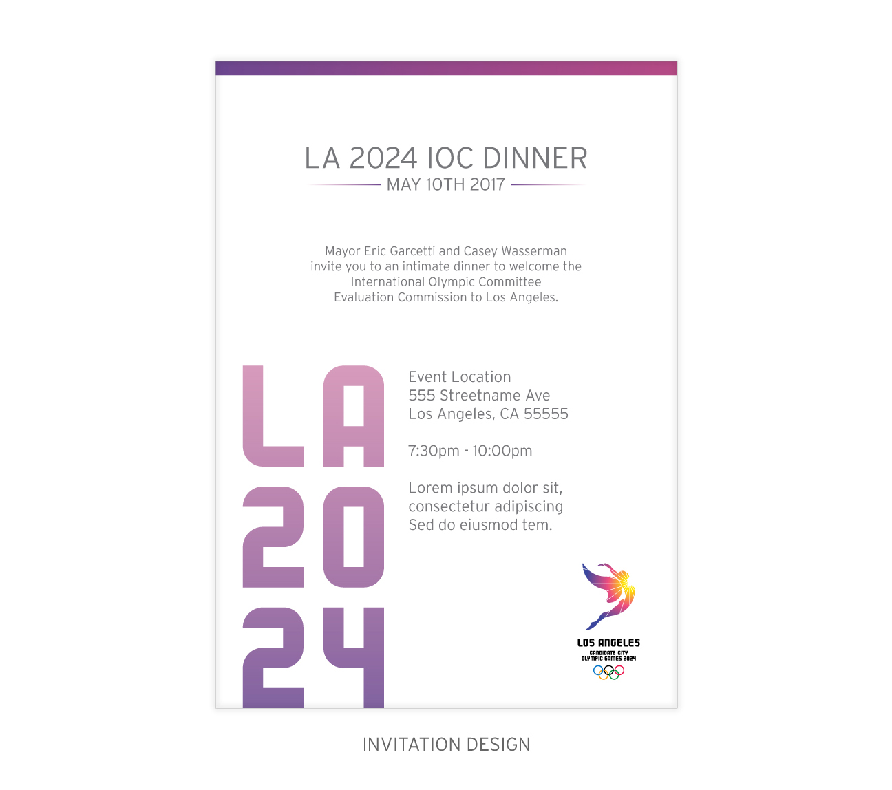
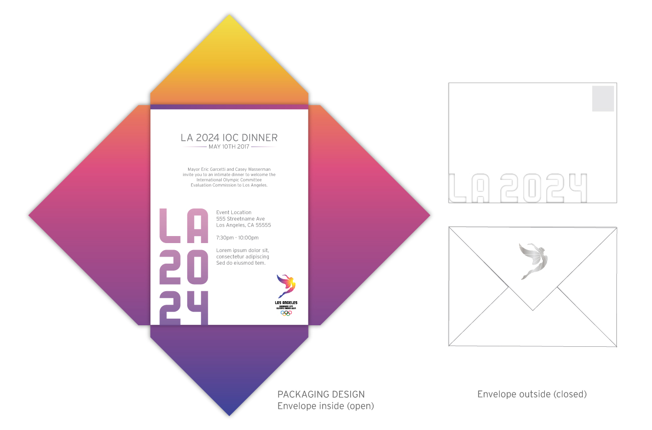
This invite needed to be clean, sleek, concise, and unique. The invite was matte paper, except for the “LA 2024” letters that utilize a UV gloss coating, to make them really pop in print. For the envelope packaging I designed the structure and its 4-way opening to make a strong impression on the receiver, using a soft-to-touch matte finish. The packaging colors are representative of a sunrise, and are in line with LA2028’s branding. The closed envelope looked like a traditional envelope, and included the recipient’s name in calligraphy. I used a clean, white design on the exterior to provide contrast and surprise when the invite was opened to reveal a powerful gradient.